Creating a United States CO2 Emissions Streamlit Application
2 minute read
Hey readers! For this project, I wanted to create an application that displayed CO2 emissions for each state in the US. To do this I am going to use Python and streamlit.
The data for this project was obtained from https://www.eia.gov/environment/emissions/state/
The first thing I am going to do is import the necessary libraries
import pandas as pd
import folium as folium
from streamlit_folium import folium_static
import plotly.express as ps
import streamlit as st
Folium is a package that is used for visualizing geospatial data. We can use this package with steamlit to display maps for this application. You can see also see that I am importing a package entitled streamlit_folium. This will be used to display the folium map in the streamlit application. plotly.express will be used for creating an interactive bar graph.
#Import state data
df = pd.read_csv("US State CO2 Emissions.csv")
#Get us state boundries
data_url = (
"https://raw.githubusercontent.com/python-visualization/folium/master/examples/data"
)
us_states_url = f"{data_url}/us-states.json"
# Define variables for selector
year = df.Year.unique()
#Create selector and title for selector
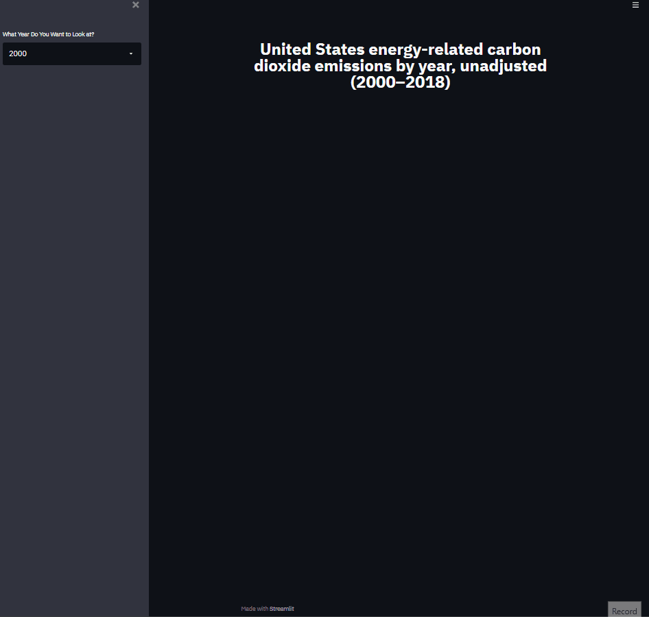
selector_year = st.sidebar.selectbox(label="What Year Do You Want to Look at?", options = year)
Let’s take a look and see how this displays in streamlit
Now I am going to focus on the US map functionaility
#Filter by year
df_filt = df[df["Year"] == selector_year]

#Add title above US map
st.markdown("## <center> USA CO2 Emissions For The Year {} </center>".format(str(selector_year)), unsafe_allow_html=True)
m = folium.Map(location=[48, -102], zoom_start=3)
folium.Choropleth(geo_data = us_states_url,
name = 'choropleth',
data = df_filt,
columns = ["State Ab", "CO2"],
highlight=True,
fill_color='YlOrRd',
legend_name= 'CO2 Emissions (Million Metric Tons)',
key_on= 'feature.id').add_to(m)

#Display map
folium_static(m)
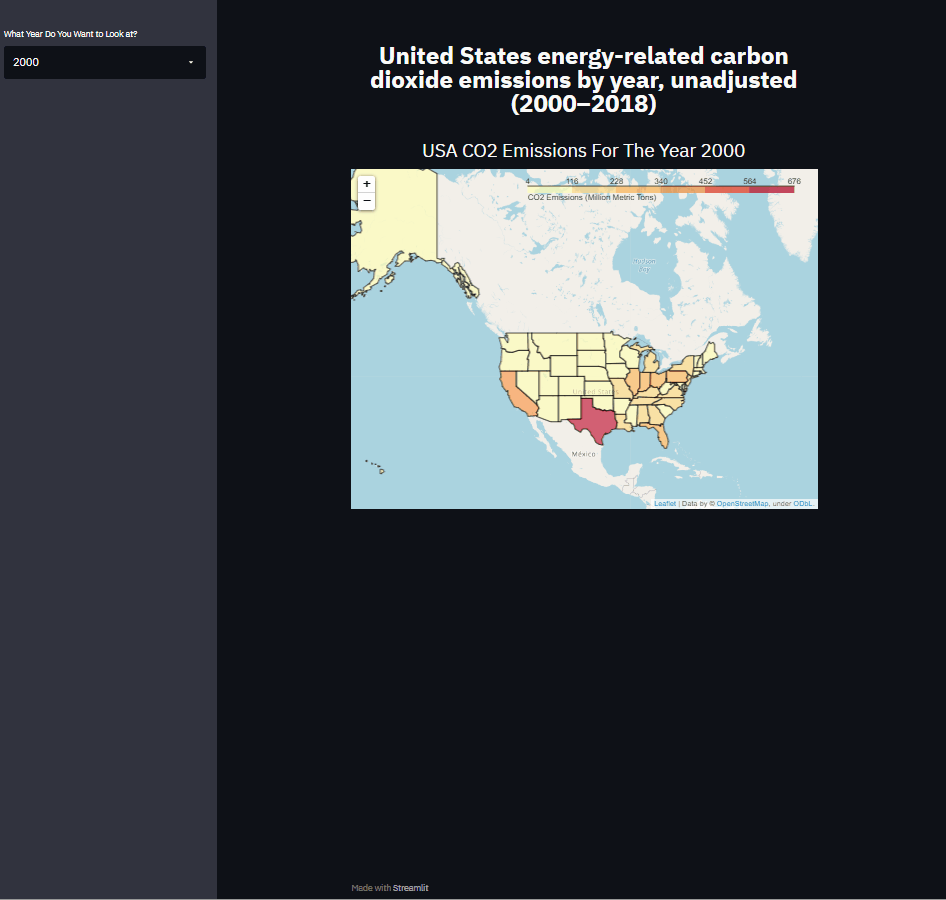
One of the issues with the state of this map, is that it does not tell the viewer what the CO2 emissions for a state are when hovering the cursor over said state. To over come this, I am going to incorporate interactive markers that display these data.
#Add co2 markers
for i in range(0,len(df_filt)):
   folium.Marker(
      location=[df_filt.iloc[i]['latitude'], df_filt.iloc[i]['longitude']],
      popup=df_filt.iloc[i]['State'] + " CO2 Emisions = "+str(df_filt.iloc[i]['CO2']),
   ).add_to(m)

#Display map
folium_static(m)
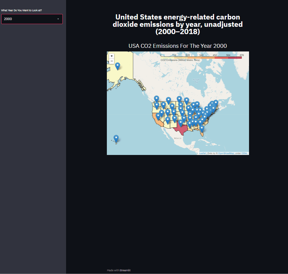
This visualization gives a more interactive experience for users
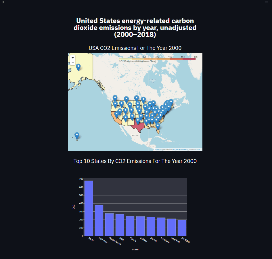
The last visualization I want to incorporate in this application is an interactive bar graph that displays the top 10 states by CO2 emissions. To do this I will use the plotly.express library.
#Bar chart title
st.markdown("## <center> Top 10 States By CO2 Emissions For The Year {} </center>".format(str(selector_year)), unsafe_allow_html=True)

#bar chart
ax = ps.bar(df_filt.sort_values("CO2", ascending= False)[0:10], x = 'State', y = 'CO2')
st.plotly_chart(ax)
There you have it! A basic CO2 emissions application. Please email me if you have any questions. Happy coding!